Colour
Colour Palette
Our colour palette builds on Everyday Reward’s strong association with orange.
Illustration shade and tone
Dark and light orange are to create shade and tone for illustrations.
Secondary colours
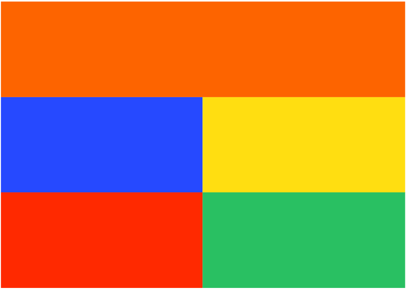
Orange is supported by four secondary colours; mint, charcoal, grey and white.
Mint plays an important role by reflecting our brand pillars of fresh, sustainability and health.
Orange
$orange
RGB
CMYK
HEX
PMS
253 100 0
0 74 100 0
FD6400
1505 C
151 U
Dark Orange (Restricted use only)
$dark-orange
RGB
CMYK
HEX
PMS
255 82 0
0 82 100 0
FF5200
Orange 021 C
Orange 021 U
Light Orange (Restricted use only)
$light-orange
RGB
CMYK
HEX
PMS
255 122 0
0 64 100 0
FF7A00
1495 C
150 U
Light Grey
$light-grey
RGB
CMYK
HEX
PMS
242 242 242
0 0 0 6
F2F2F2
Cool Gray 1 C
Cool Gray 1 U
Mint
$mint
RGB
CMYK
HEX
PMS
207 226 216
23 4 15 0
CFE2D8
9502 C
9044 U
White
$white
RGB
CMYK
HEX
PMS
255 255 255
0 0 0 0
FFFFFF
White
Charcoal
$charcoal
RGB
CMYK
HEX
PMS
56 69 79
20 0 0 85
38454F
Cool Grey 11 C
Cool Grey 11 U
Colour Usage ratios
This diagram shows our colour ratios and describes how we want viewers to remember our brand.
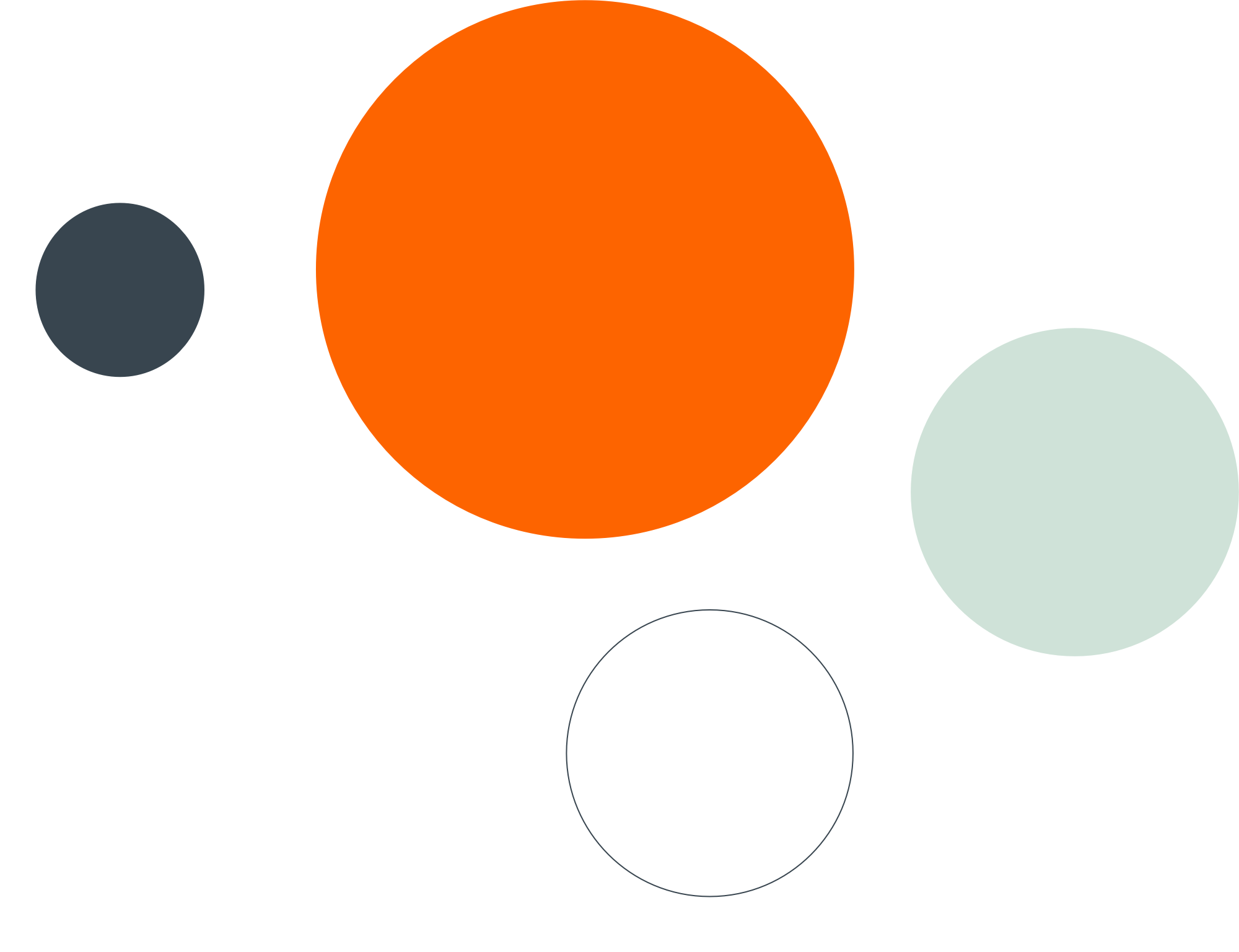
The usage is flexible, allowing our brand the versatility to excite and engage when needed. However, it’s important to keep the following in mind:
- Orange is our primary brand colour and should be prominent in the application.
- Mint has an ‘always on’ approach and should be included in every application. This can be dialed up or down depending on the purpose.
- Charcoal is our most functional colour as it is very accessible. It is used for copy and illustration only.
- White and light grey are our neutral tones and help to balance the brand.
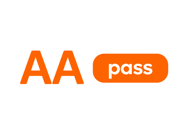
Colour Accessibility
We want people of all ablilities to experience our brand in the same way, so we’ve outlined the successful colour combinations.
Large text is defined as above:
14pt/18.5px Fresh Sans Medium
18pt/24px Fresh Sans Regular
Normal text is defined as below:
13pt/17px Fresh Sans Medium
17pt/23px Fresh Sans Regular
- Our charcoal colour is our functional colour as it has the highest pass rate with enough contrast to be used on all our background colours at large text size.
- Orange text should only be used at ‘large size’.
- Normal text should only be used in charcoal on white, grey and mint.

AAA Pass - Most accessible
Charcoal on white9.84
Large text
Normal text
Objects and UI
Charcoal on light grey8.79
Large text
Normal text
Objects and UI
Charcoal on mint7.28
Large text
Normal text
Objects and UI
AA Pass - Large text and objects only
Charcoal on orange3.28
Large text
Normal text
Objects and UI
White on orange3.1
Large text
Normal text
Objects and UI
Orange on white7.28
Large text
Normal text
Objects and UI
Fail - not recommended
Accessible fail
Mint on orange2.1
Accessible fail
Light grey on orange2.68
Accessible fail
Light grey on white1.1
Accessible fail
Mint on white2.2
Accessible fail
Light grey on mint1.2
Accessible fail
White on mint1.35
Accessible fail
Orange on mint2.21
Accessible fail
Mint on light grey2.2
Accessible fail
Orange on light grey2.68
Accessible fail
White on light grey1.1
Colour Do’s and Don’ts
Colour plays a massive role in the Everyday Rewards brand, so it’s important that we treat colour properly.
Do
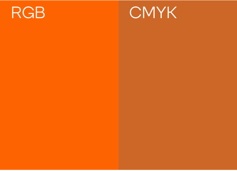
Use the correct color breakdowns for screen and print. RGB/HEX screen, CMYK/PMS print.

Don't
Add colour effects to our communications, to avoiding losing our bold fresh look.

Do
Follow the correct colour ratio guidelines.
Don't
Add any new colours in the palette.
Do
Use colours that pass WCAG 2.0 level AA accessibility for text and our logo.